


Logo & Brand Design for Palomín Bird Repellent
Introduction
Introduction
MG Limpieza expanded its portfolio with Palomín, a non-toxic, highly effective pigeon repellent. The goal was to engineer a strategic product relaunch anchored on two pillars: a refreshed visual identity tailored for maximum point-of-sale impact, and clear messaging spotlighting the brand's core competitive edge.
The strategy culminated in a phased rollout across retail distribution channels, powered by the refreshed brand identity.
About the Client
MG Limpieza develops domestic and industrial cleaning and sanitation solutions. With a recognized footprint in the market, the enterprise aimed to amplify Palomín's retail presence and differentiate it in a saturated, highly traditional category.
Project Objectives
- Craft a new logo with elevated shelf recognition and point-of-sale impact.
- Communicate the product’s function instantaneously at first glance.
- Ensure high visibility on store shelves against established competitors.
- Position Palomín as an effective, environmentally responsible alternative.
The Challenge
The core tension centered on communicating two seemingly opposite attributes simultaneously: efficacy (proven performance) and safety (non-toxic formulation). The vast majority of market competitors rely on aggressive cues and caution-tape color palettes typical of industrial chemicals.
The challenge was to define a fresh visual vernacular that stands out on retail shelves while earning immediate trust from eco-conscious consumers.
Design Decisions
Vibrant green was chosen as the chromatic anchor to reinforce the brand's primary value proposition: Palomín is safe and gentle on the surrounding environment. Green signals nature, safety, and environmental awareness—traits that establish an attractive contrast against harsh chemical repellents.
The chosen typography balances muscular weight with distance legibility, ensuring instant brand recognition even in compact retail formats. The logo mark incorporates a stylized bird silhouette that communicates product utility universally and immediately.
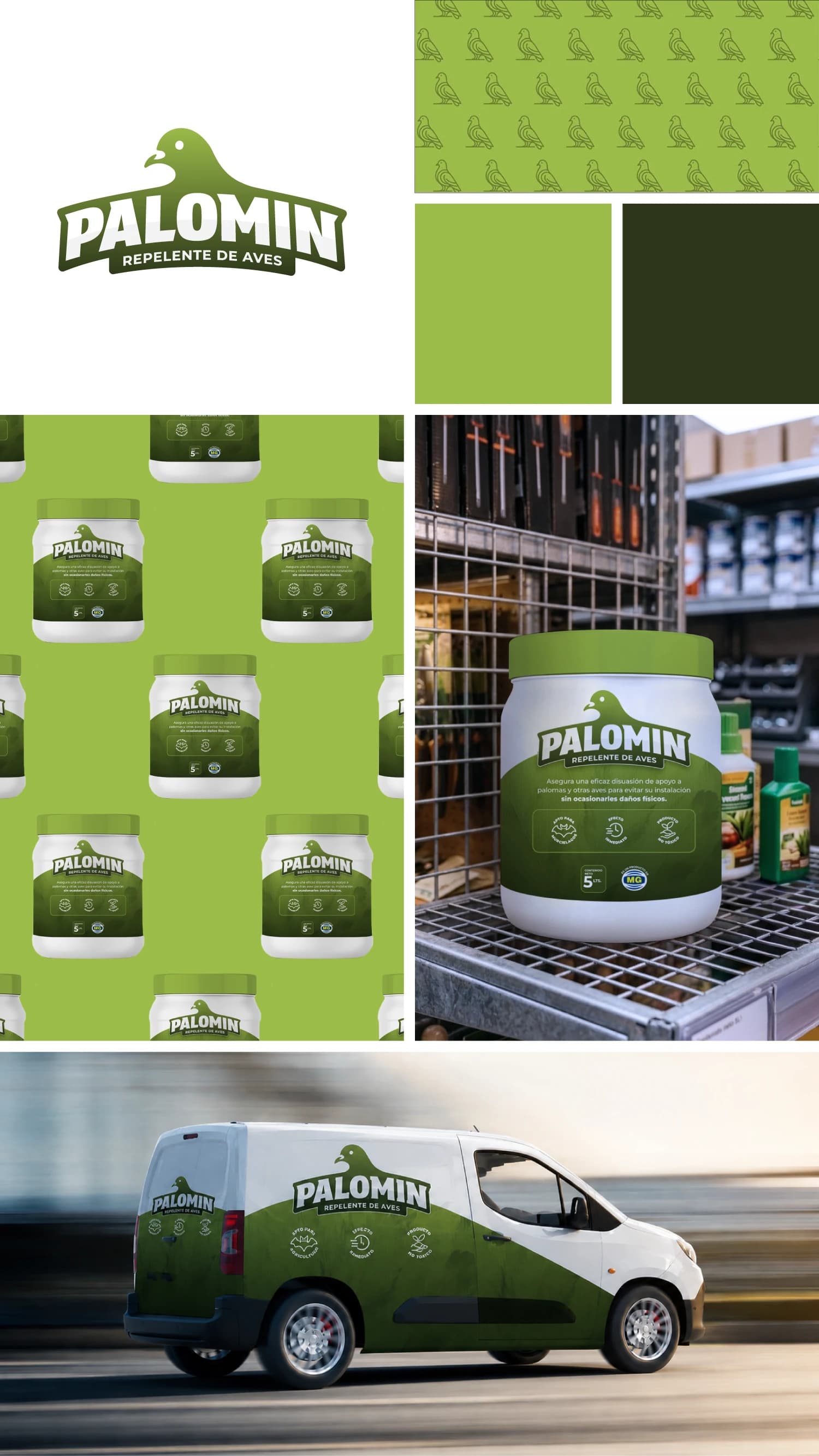
Outcome
The refreshed visual identity rolled out seamlessly across packaging and distribution channels. The product achieved heightened shelf-level recognition, and the strategic positioning clearly established Palomín as the premier non-toxic solution in its category.