

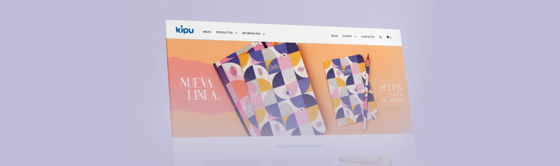
Animated Logo - Kipu
Introduction
This project involved developing a logo animation to extend Kipu's visual identity into the audiovisual language. The goal was to transform a static element into a motion design piece capable of preserving the warm, minimalist, and considered essence of the original brand identity.
The animation was designed as a flexible asset to integrate naturally into different digital content formats — serving as an intro and outro for social media videos, product launches, institutional content, and promotional pieces.
About the Client
Kipu is a brand with a visual identity focused on conveying closeness, simplicity, and care at every touchpoint. Its digital communication requires audiovisual assets that maintain these attributes and reinforce brand recognition.
The need arose from the growth of its digital content output and the importance of having a motion identity consistent with its established visual language.
Project Goals
The primary goal was to create a logo animation that extended the visual identity system into motion design while preserving its personality and recognisability.
The specific objectives were:
- Turn the logo into a dynamic audiovisual asset.
- Maintain the brand's minimalist and warm aesthetic.
- Create an animation flexible enough for different digital formats.
- Reinforce brand recognition in audiovisual content.
- Develop a reusable asset for social media and institutional communication.
The Challenge
The main challenge was generating movement without losing the simplicity that characterises the identity. The animation needed to add dynamism and personality while avoiding unnecessary effects that could alter the brand's perception.
It was also essential to develop a piece short and versatile enough to work as an opener and closer across different content types, maintaining a consistent presence across varied formats and digital platforms.
Research
The research focused on analysing the behaviour of animated visual identities and motion branding references with a minimalist language. Different timing, easing, transition, and composition approaches were studied to determine which type of movement could best represent the brand's attributes.
The strategy prioritised a simple, elegant, and recognisable animation where movement functions as a natural extension of the original design — not as an independent element.
Creative Process
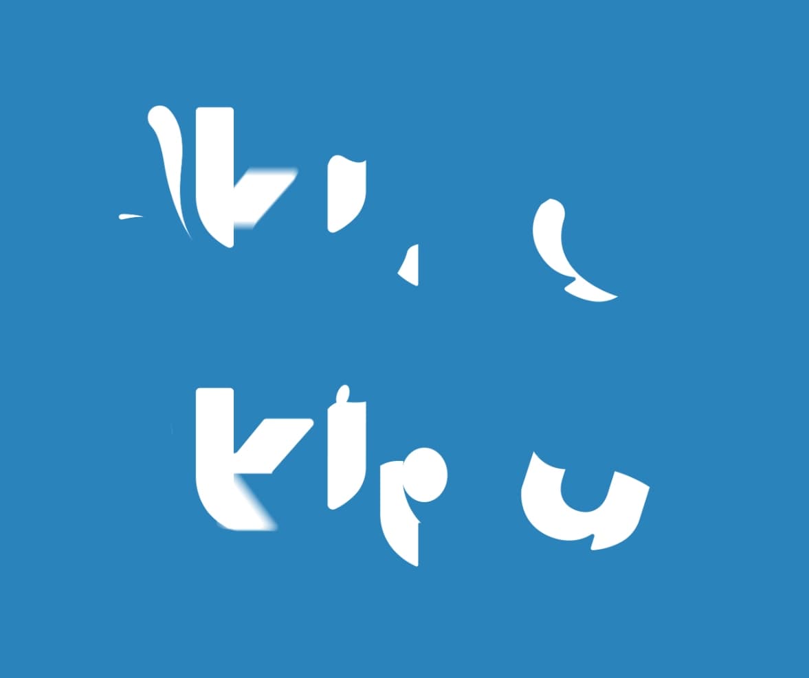
The creative process began with exploring different ways to reveal and transform the logotype. Various tests of rhythm, timing, and movement were carried out until a balanced and natural sequence was found.
Successive iterations allowed us to simplify the animation and remove unnecessary movement, achieving a final solution in which every transition serves a clear purpose and reinforces the brand identity.
Design Decisions
The animation preserves the proportions, shapes, and key characteristics of the original logotype to maintain its recognisability. Movement was built through smooth transitions and controlled timing, reinforcing the brand's warm and minimalist personality.
Excessive effects were avoided in favour of a clean composition with precise movements and a fluid animation curve. This approach allows the logo to function equally well in promotional pieces, institutional content, and social media publications.
Tools Used
Adobe After Effects Adobe Illustrator