


Brand Design for Be Grow One
Introduction
Be Grow One is a brand built to represent the evolution of an enterprise with a solid track record in corporate solutions toward an ecosystem powered by artificial intelligence, automation, and digital transformation. The project entailed designing a contemporary visual identity that reflects the company's strategic pivot while preserving the trust and endorsement earned over decades. The new identity positions Be Grow One as a specialized hub for emerging technologies, signaling innovation, scalability, and operational efficiency. The outcome is a minimalist, flexible visual system geared to thrive across digital interfaces, tech platforms, and online/offline communication initiatives.
About the Client
Be Grow One is an enterprise specialized in AI solutions, process automation, RPA, and workflow optimization for SMBs and mid-market companies. The brand emerged as a strategic evolution from a consultancy with deep heritage, expanding its value proposition into cutting-edge tech and digital acceleration. Its target audience includes organizations aiming to modernize workflows, eliminate manual overhead, and unlock operational excellence through integrated automation and data analytics.
Project Objectives
The core objective was to create a visual identity capturing the firm's technological leap while preserving the reliability anchored in its legacy. The refreshed brand needed to project innovation, growth, and leadership, while distinctly carving out the new AI-focused business unit. Specific milestones included:
- Modernizing overall brand perception.
- Communicating innovation and digital transformation.
- Reinforcing themes of scalability and growth.
- Sustaining continuity with the heritage corporate architecture.
- Designing a responsive, digital-native visual design system.
The Challenge
The fundamental challenge was engineering a brand identity that signals a modern technological dawn without severing ties to the equity and credibility already established. Striking the balance between an avant-garde visual language and institutional solidity was paramount. Furthermore, the identity needed sufficient versatility to scale across digital touchpoints, investor decks, social channels, and forthcoming SaaS platforms while sustaining consistency at every contact point.
Research & Strategy
The strategy kicked off by benchmarking global leaders in AI software, enterprise automation, and enterprise B2B tech. We researched emerging graphic patterns, contemporary type design systems, and design aesthetics deployed by vanguard tech ventures to map distinct differentiation levers. From this research, foundational brand values emerged: growth, forward-looking innovation, trust, simplicity, and continuous evolution. These pillars guided every creative decision, shaping an identity engineered to propel the brand in a competitive tech landscape.
Creative Process
The creative journey explored themes around upward trajectory, computational intelligence, and corporate evolution. Through iterative design sprints, we finessed the typographic geometry, custom graphic devices, and mark proportions into an unmistakable, high-recall system. Every element was chosen to affirm technological leadership with clarity and timeless readability.

Design Decisions
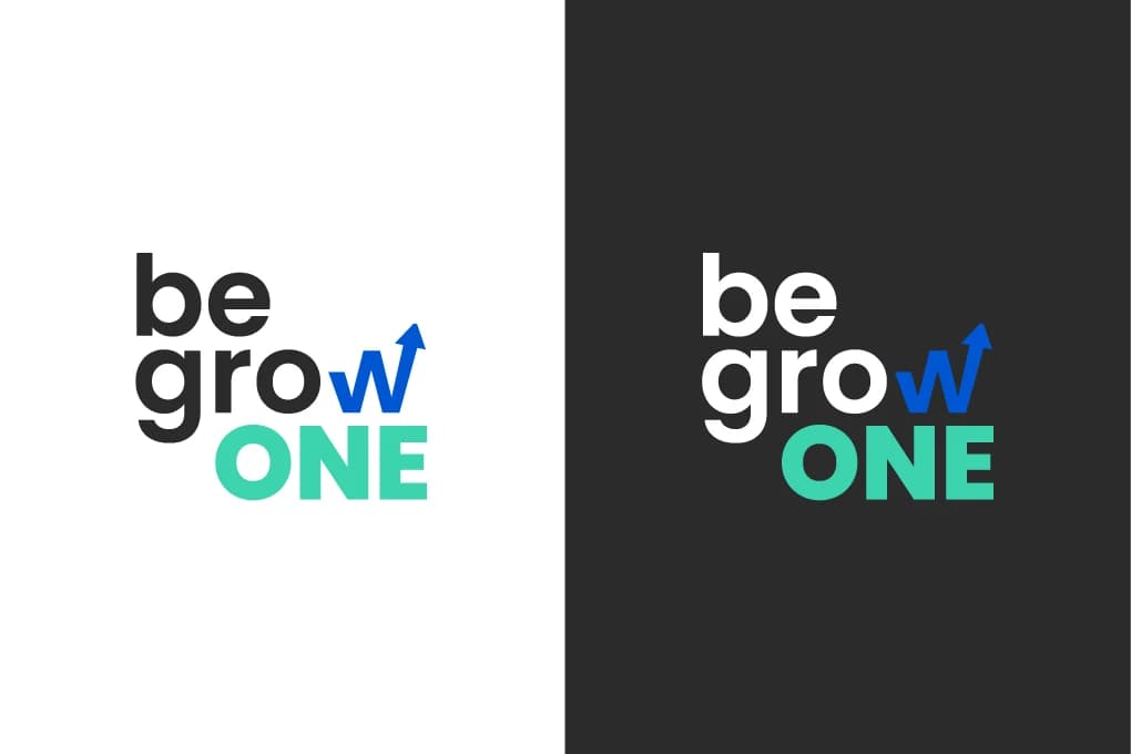
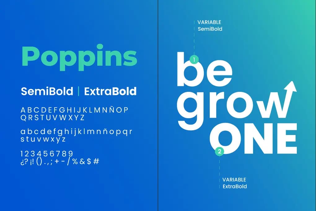
The visual identity relies on a geometric sans-serif typeface boasting clean lines and strong visual presence to communicate authority, poise, and modernity. As a signature graphic signature, the letter 'W' integrates an upward diagonal arrow within its stroke geometry—symbolizing progress, continuous improvement, and technological scaling. The color palette pairs corporate deep blue (evoking stability, pedigree, and trustworthiness) with vibrant cyan/aqua accents (signifying AI innovation and agile digital transformation). Spacious white space and high-contrast typographic hierarchy ensure crisp readability across both screens and physical collateral.
Tools Used
Adobe Illustrator Adobe Photoshop Adobe After Effects Figma
Results & Impact
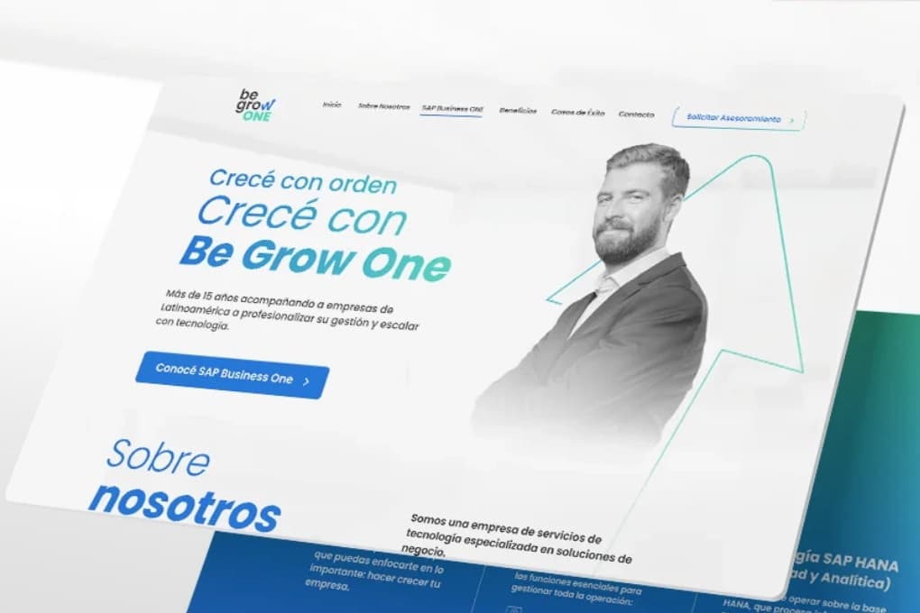
The refreshed identity solidified Be Grow One's market stance as an advanced AI and automation leader, noticeably elevating its tech sector profile. The new system conveys a cohesive, contemporary, and sophisticated brand impression, driving faster recognition and enhancing partner confidence. Additionally, the modular design system establishes a durable springboard for future marketing campaigns, UI products, and digital growth initiatives, maintaining absolute visual coherence across global touchpoints.